Visual Identity
Goal
Exploration

The visual identity explores the metaphor of stone, drawing a conceptual link between the product and the Avalanche network - the protocol that powers and supports it.
Stone represents strength, reliability, and resilience - values that mirror both the nature of the Avalanche ecosystem and the long - term vision of the product.
Touchpoints
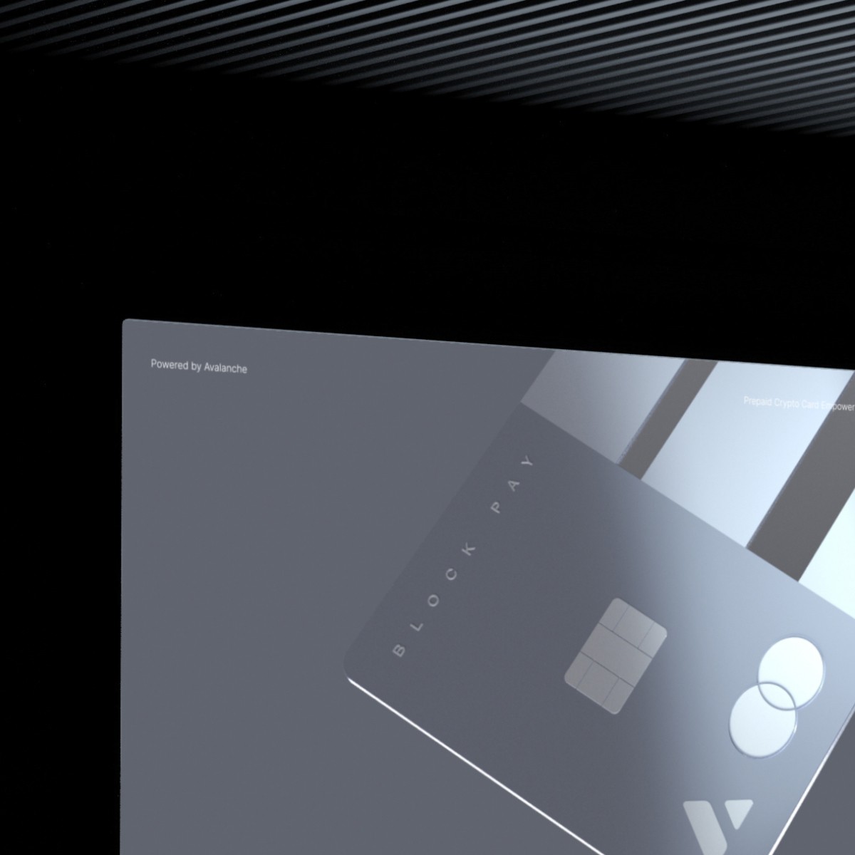
Designed a custom brand typeform that serves a dual role - it reads as the letter "B" while also evoking the structure of block-like cells, reinforcing the crypto-native feel. The card features translucent insets, allowing light to pass through and create a subtle inner glow - adding depth and a sense of digital presence.
The card comes in three versions: the signature brand color, a dark edition, and a light edition - offering visual flexibility while maintaining strong brand coherence.


Touchpoints

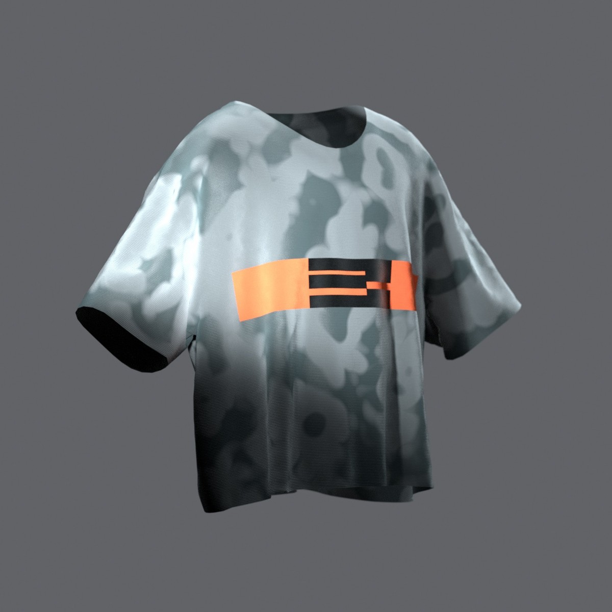
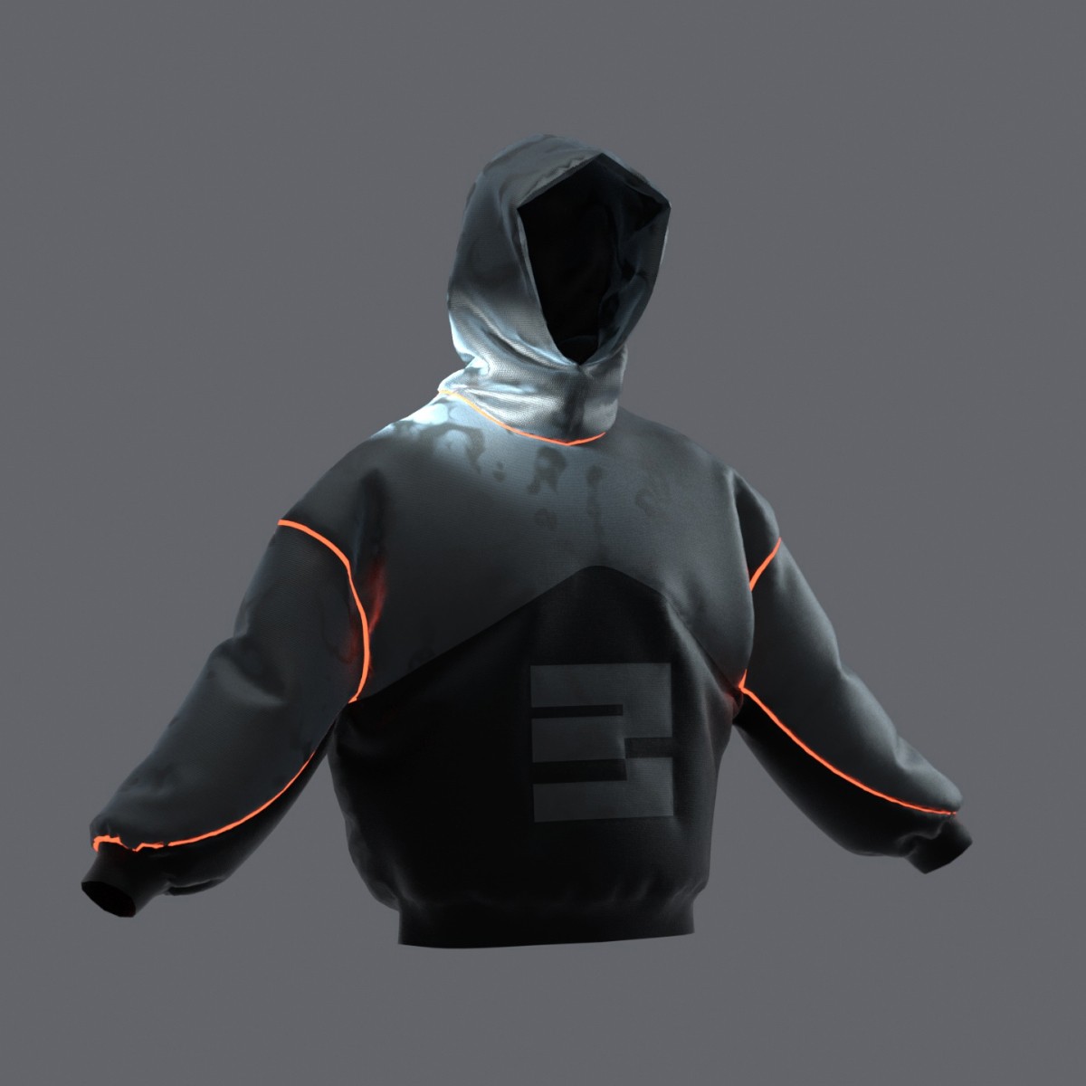
Created a small capsule collection of hoodies and t-shirts to demonstrate how the visual style scales across physical touchpoints. The merch extends the identity beyond digital - letting people literally wear the brand.
Special attention was given to the material texture - it reacts to light, subtly shifting its surface feel and adding depth to the experience.


Touchpoints

Showcased how the identity performs across different touchpoints - from lightboxes and advertising surfaces to mobile interfaces - giving a full picture of how the visual system lives in the real world.
Minimalism and confident color play make the brand stand out with clarity and strength, positioning it as a recognizable and trustworthy player in the Web3 space.