Product
Goal
Exploration
The visual identity was built around a sense of solidity and reliability - inspired by the timeless presence of stone. It reflects the product’s stable core and builds trust from the first impression.
At the same time, bright crystal elements reflect the product’s boldness and innovation, making it stand out confidently in a competitive market.
Clean, user-centered interfaces with carefully crafted details create a smooth, engaging experience that invites confidence and increases user involvement.
Touchpoints


On the login page, I added the option to sign in by scanning a QR code generated on the platform using the mobile app, speeding up the login process for the web version.
When the user enters their email, the platform identifies them and displays a personalized welcome button to continue the flow.

The main screen features all essential actions at a glance - receive, send, and exchange funds - with the ability to manage multiple currency accounts and view a snapshot of recent activity.
To enhance user immersion, I reinforced the layout with a branded visual element, echoing the product’s identity and setting a distinct tone from the very first touchpoint.


The interactive sidebar is designed with two states - expanded and collapsed - allowing users to focus on key information by minimizing visual noise when needed. This flexibility helps streamline the user experience, especially in tasks that require concentration or repeated interaction.
Beyond its current functionality, the sidebar is built with scalability in mind. Its modular structure allows for easy expansion as the product grows - new sections or features can be seamlessly integrated without disrupting the overall layout or usability. This forward-thinking approach ensures the design remains adaptable and future-proof.


The user’s activity section provides a complete overview of all transactions over time. By clicking on an event, a convenient sidebar opens with details and an option to repeat the transaction. There is also the ability to download the transaction statement.
Additionally, users can view detailed information about the operation, including the conversion amount at the time of the transaction, the fee amount, and more.


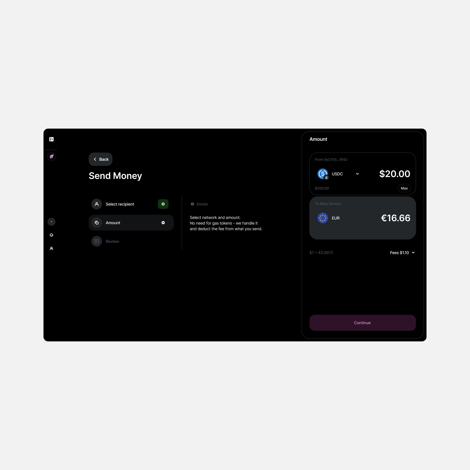


The sending flow is divided into steps to guide and assist the user throughout the entire process of sending funds.
Each step includes brief descriptions as hints next to it.
On the final confirmation screen, a graphic element is added to connect the product with the established identity and create a pleasant aftertaste from using the interface.


An interactive deposit block was added with animated 3D effects.
The card reacts to cursor movement, creating a sense of depth and perspective. On click, the wallet address is automatically copied.
A QR code is also available for quick scanning.


Added a smart search experience. The user sees a full list of recipients from the first character, and once more than two characters are typed, the search shows the matching recipient with their latest related activities.
Special attention was given to empty states, where a visual from the product's identity is shown to reinforce brand connection.
Touchpoints
Extensive work has been done to research and create a design direction based on customer types, core goals, and the company’s mission.
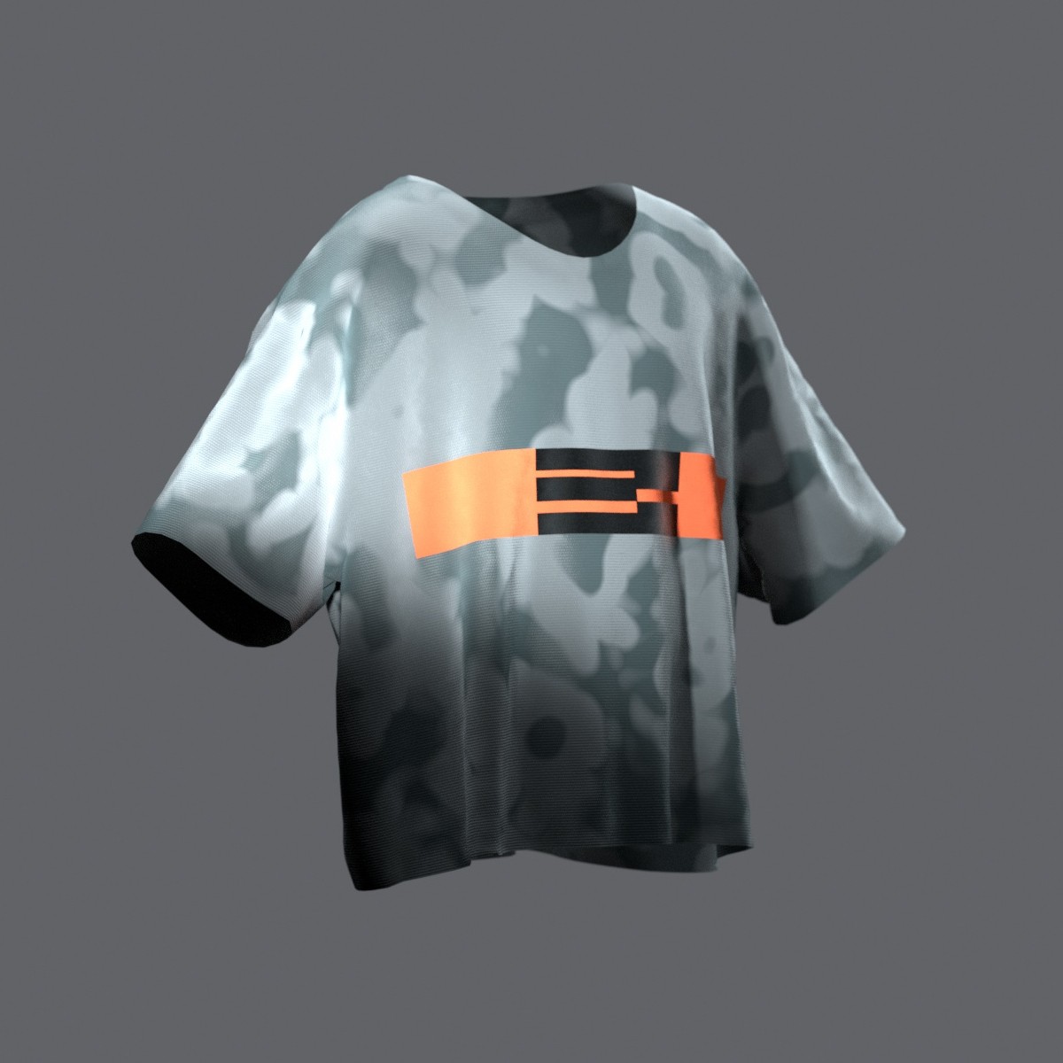
There were tons of experiments and efforts not only in creating graphic elements but also in scaling them across various media, including outdoor advertising, social networks, and web platforms.


Touchpoints

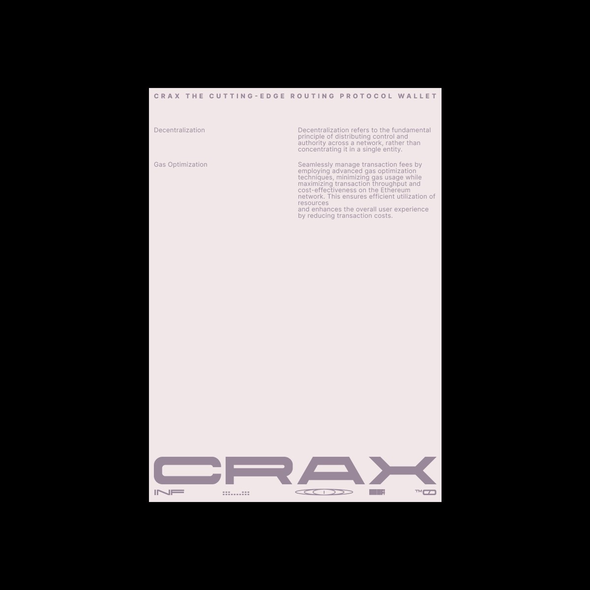
We can clearly observe how the visual identity performs across various media formats. To ensure maximum impact, wide 3D landscapes were developed specifically to stand out on large-scale displays such as billboards and lightboxes at conferences. These immersive 3D scenes help capture attention and reinforce brand recognition in physical spaces.
Additionally, the poster layouts were designed with a focus on precision and consistency, adding a strong sense of order and reliability to the product’s overall look. This structured approach not only strengthens the brand’s visual presence but also conveys professionalism and trustworthiness, making the product feel more stable and credible across all touchpoints.