Goal
Exploration

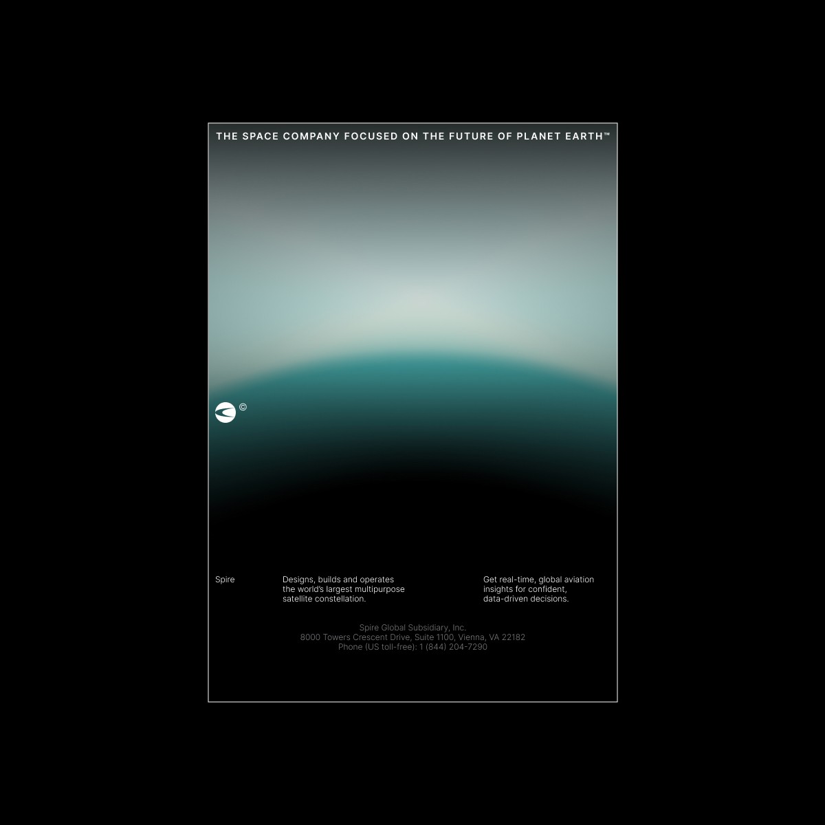
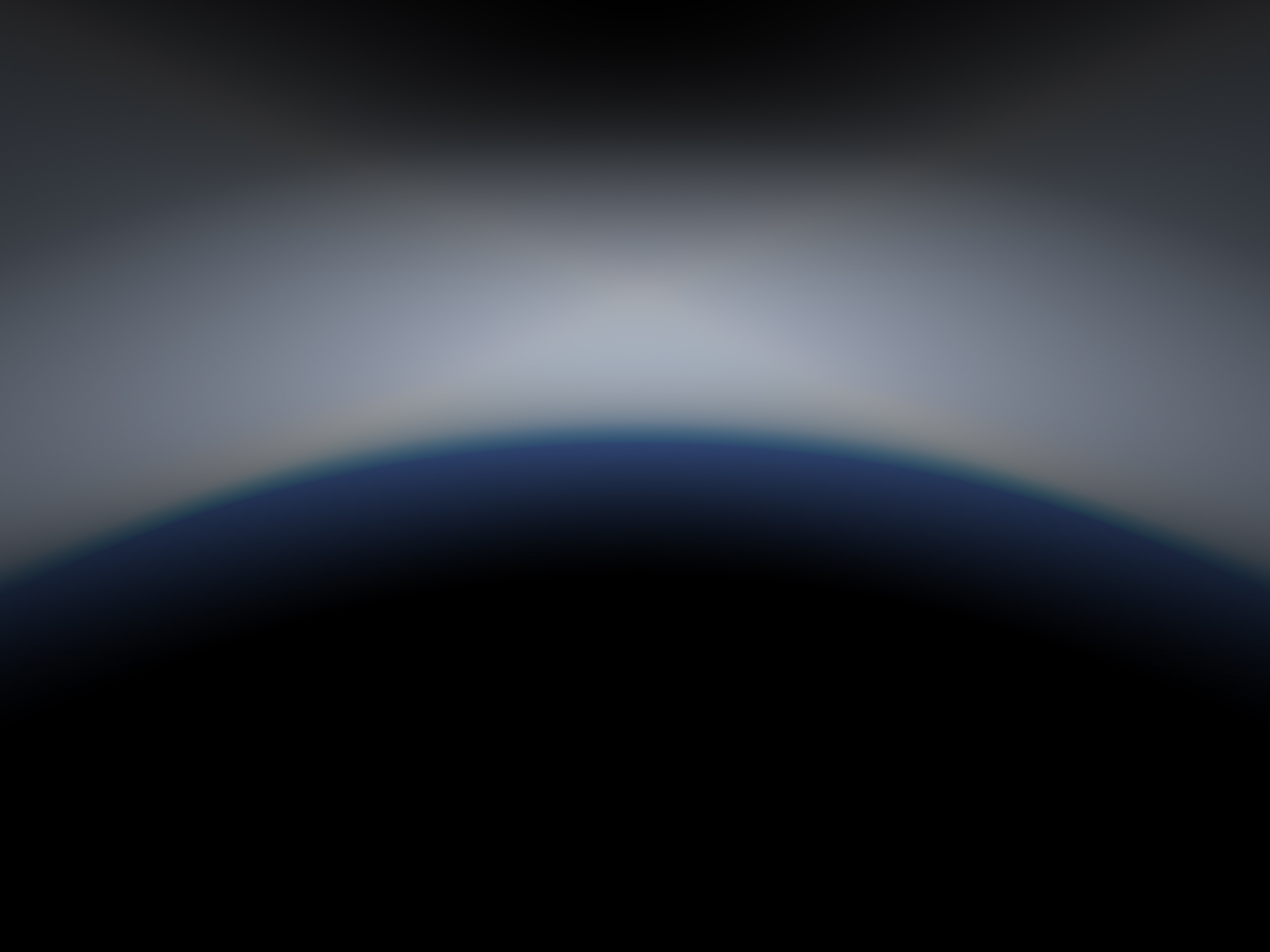
The idea was inspired by the glow of a planet, which was reflected in the colors and techniques of the visual style. Gradients and color palettes similar to the glowing hues of Earth were carefully chosen to evoke a sense of organic illumination. These elements found their application in the transitions of the corporate website, where the soft blending of colors creates a dynamic, yet harmonious flow. The use of these gradients reinforces the brand’s identity, giving the website an engaging, fluid experience that mirrors the planet’s natural glow and reflects the company’s innovative approach.
This perfectly complements the company’s slogan — "Earth, we hear you."

Touchpoints

The logo was updated with a dynamic checkmark that evokes the motion of a satellite orbiting the Earth’s axis. This element brings a sense of movement to the brand and resonates with the company’s industry.
The checkmark sets a visual rhythm that continues into the typography of the company name, creating a cohesive and energetic identity.
Touchpoints

Poster and lightbox designs implement smooth gradients and glowing blends inspired by the Earth’s atmosphere, echoing the aesthetic seen in the attached visual reference. The logo and background treatments use subtle lighting techniques and dynamic curves that evoke a sense of motion, orbit, and trust — mirroring the flow of satellites around the planet.
This visual depth not only creates a futuristic and immersive impression but also helps build emotional resonance. The glowing gradients feel warm and almost tangible in physical environments like outdoor lightboxes, subtly inviting users to connect with the brand and its vision.